



Aether Display, a variable typeface
Variable Display Font
Clouds logo — the film loads from Vimeo when you’re online.
Concept
“Aether Display” is a typeface that sets out to capture the elegance of the past and the vitality of the present, seamlessly blending the understated forms of a modern serif with the expressive flow of a script.
Versatile and refined, it adapts to many uses, but it’s at its best in headlines for beauty products and fashion magazines, where style and personality are a must.
Features
- 1Smooth line transitions
- 2Medium contrast 1:5
- 3Sharp edges with optical corrections
Character specimen
- A
- B
- C
- D
- E
- F
- G
- H
- I
- J
- K
- L
- M
- N
- O
- P
- Q
- R
- S
- T
- U
- V
- W
- X
- Y
- Z
- 0
- 1
- 2
- 3
- 4
- 5
- 6
- 7
- 8
- 9
- À
- Á
- È
- É
- Ì
- Í
- Ó
- Ò
- Ù
- Ú
- !
- ?
- .
- ;
- :
- '
- "
- *
- $
- &
- %
- (
- )
- {
- }
- [
- ]
- -
- +
- =
- /
- \
04 Anatomy
Scroll to fly from plate to plate
-
Special traits01 / 03
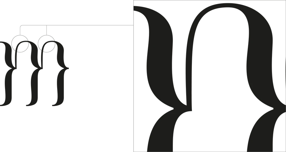
M
The arches of the M spring from the stems on an ultra-fine hairline. In the close-up, the top join: the stroke goes from thick to hairline with no visible seam.
-
Special traits02 / 03
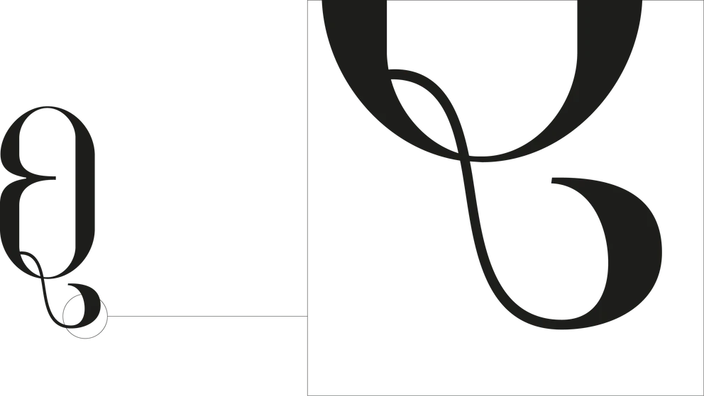
Q
The tail cuts across the bowl, drops below the baseline and rolls into a curl: the most calligraphic gesture in the typeface.
-
Special traits03 / 03
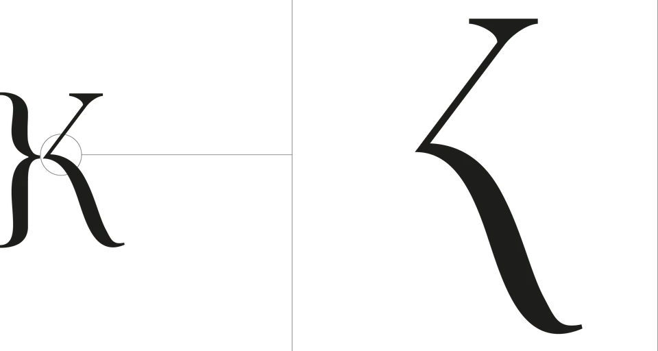
K
The arm and leg meet in a pointed vertex set apart from the stem: a sharp corner between two curves.
-
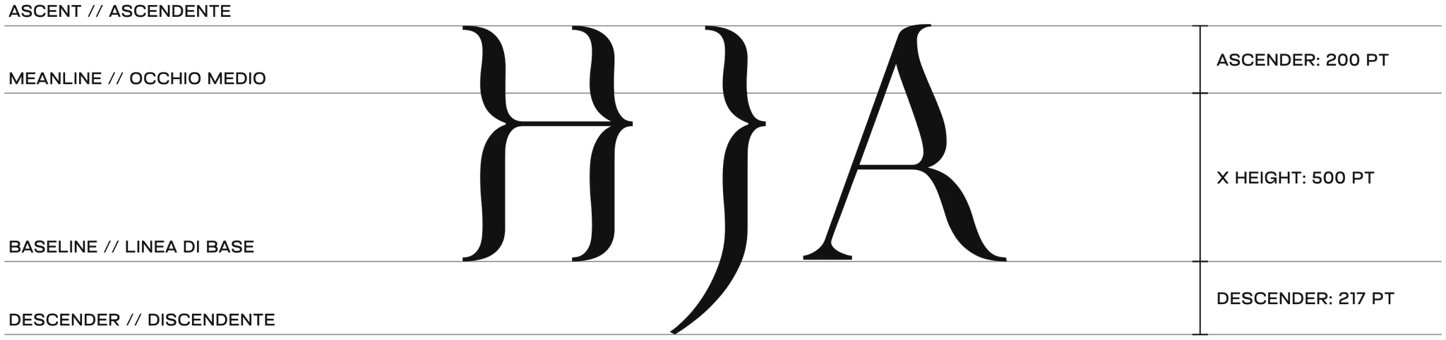
Measures01 / 02
Metrics
On a 1,000-unit em: x-height at 500, ascenders up to 700 (+200), descenders down to −217. The same guidelines hold across the entire character set.
-
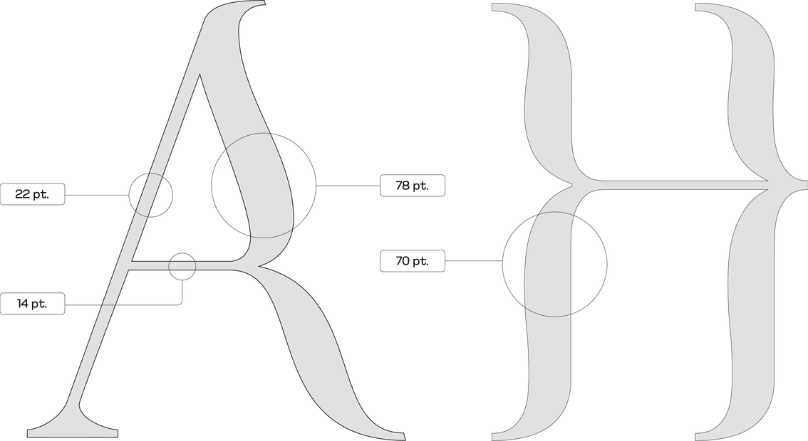
Measures02 / 02
Contrast
Stroke widths measured on the A and H: thin diagonal 22 pt, thick diagonal 78 pt, crossbar 14 pt against a 70 pt stem. That’s the medium 1:5 contrast.
Letter shapes
- Squared lettersE F H I L T
- Round lettersC G O Q S
- Diagonal lettersA V W X
- Round // squaredB D J M N P R U
- Diagonal // squaredK Z Y
06 Corrections
Scroll to fly from plate to plate
-
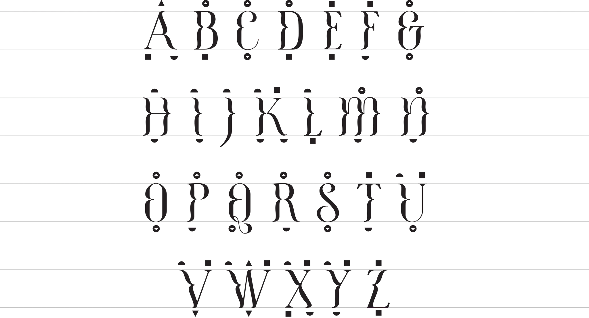
Optical corrections01 / 03
Overshoot
Round and pointed shapes extend slightly past the guidelines, so they look as tall as the flat ones. The symbols above and below each letter show where.
-
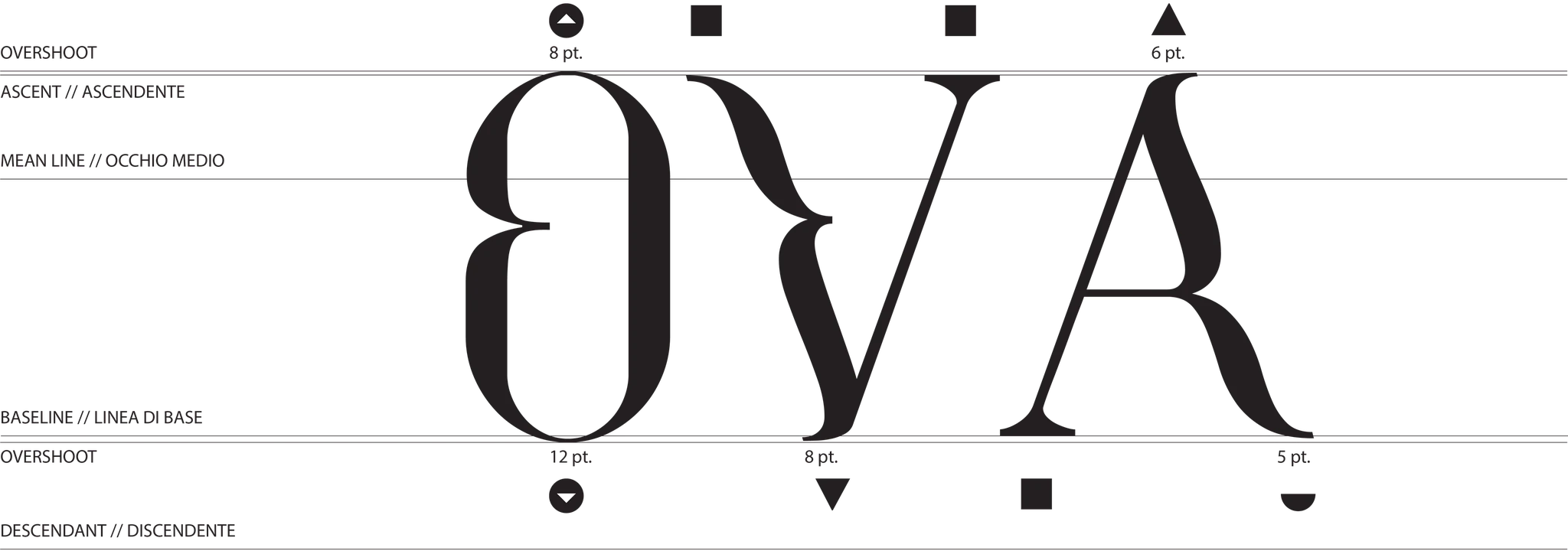
Optical corrections02 / 03
O · V · A
Up close: the O rises 8 pt above the ascender line and dips 12 pt below the baseline; the point of the V dips 8 pt; the A rises 6 pt.
-
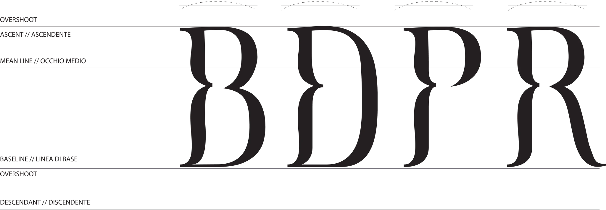
Optical corrections03 / 03
B · D · P · R
In letters with bowls, the top curve just overshoots the ascender line: the dashed arcs show by how much.
-
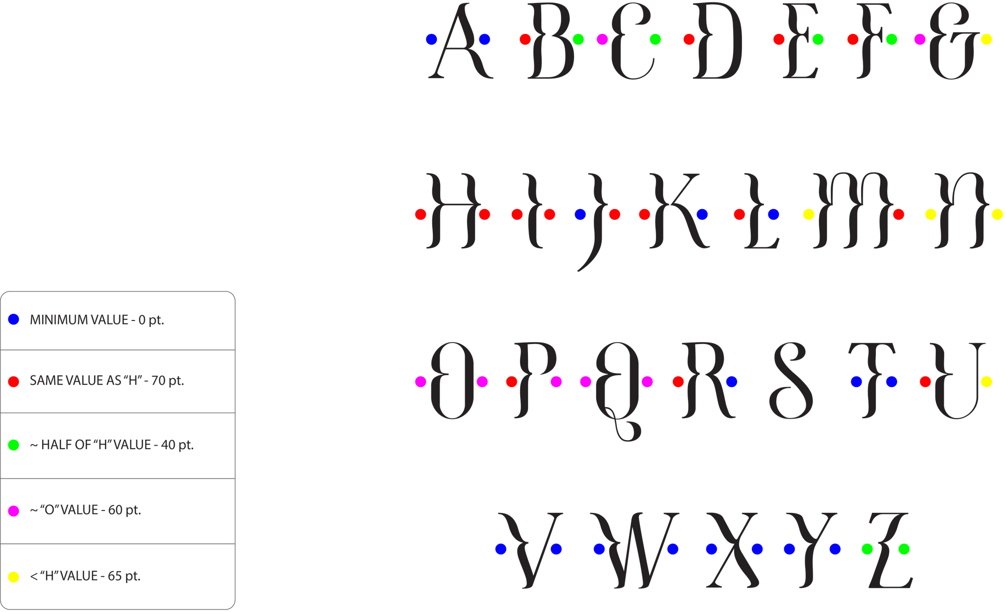
Spacing01 / 02
Sidebearings
Every letter’s sidebearings start from those of the H and the O. Each colored dot shows which value that side uses.
- Minimum value — 0 pt
- Same value as “H” — 70 pt
- ~ Half of “H” value — 40 pt
- ~ “O” value — 60 pt
- < “H” value — 65 pt
-
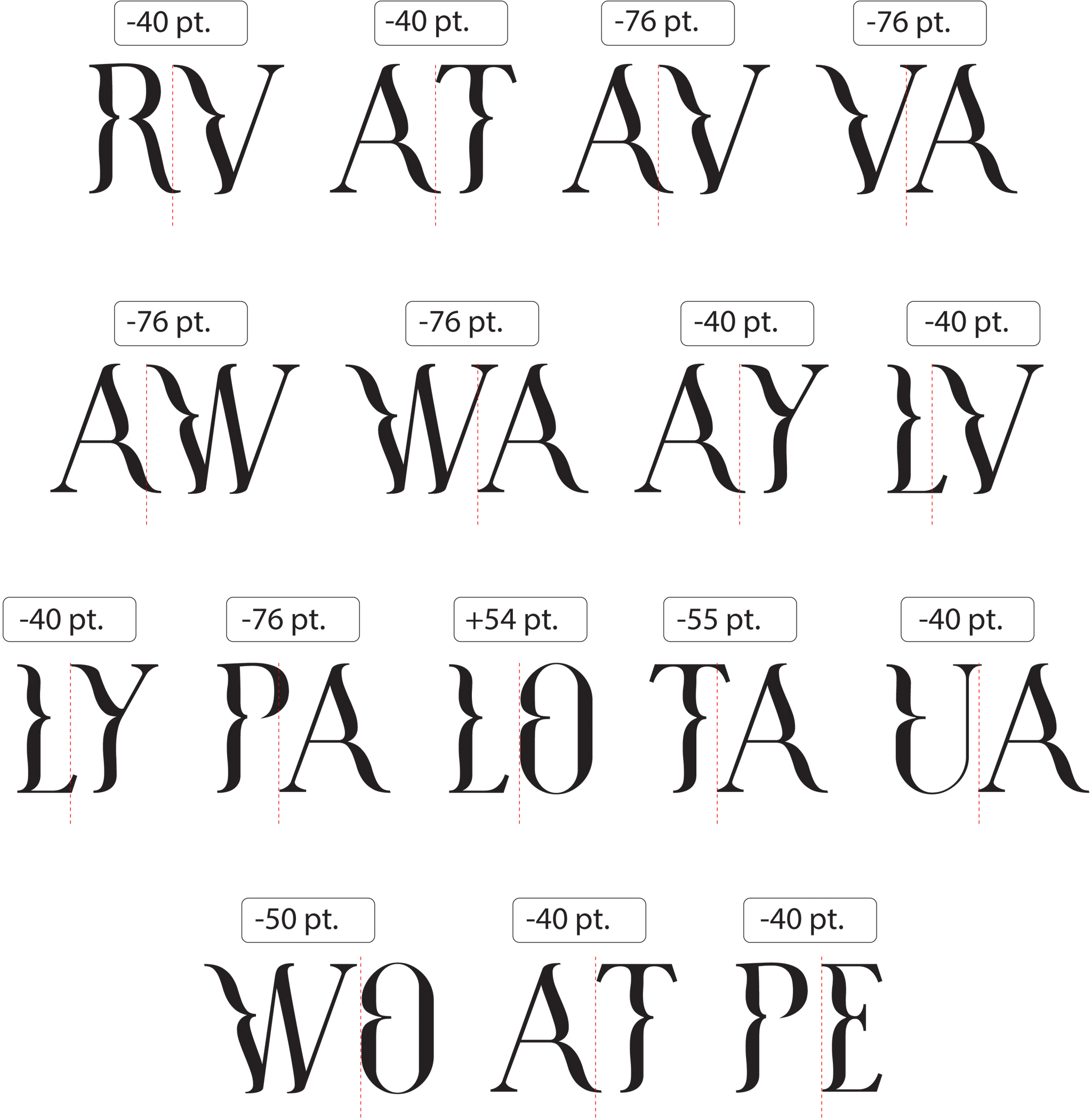
Spacing02 / 02
Kerning
Tricky pairs such as AV, AW, PA and WA are kerned as tight as −76 pt; LO, by contrast, opens up by 54 pt.
Readability
- aether118 pt
- aether60 pt
- aether45 pt
- aether30 pt
- aether12 pt
Wake up.It was only aDream