

Brand identity / Emil Cam srl
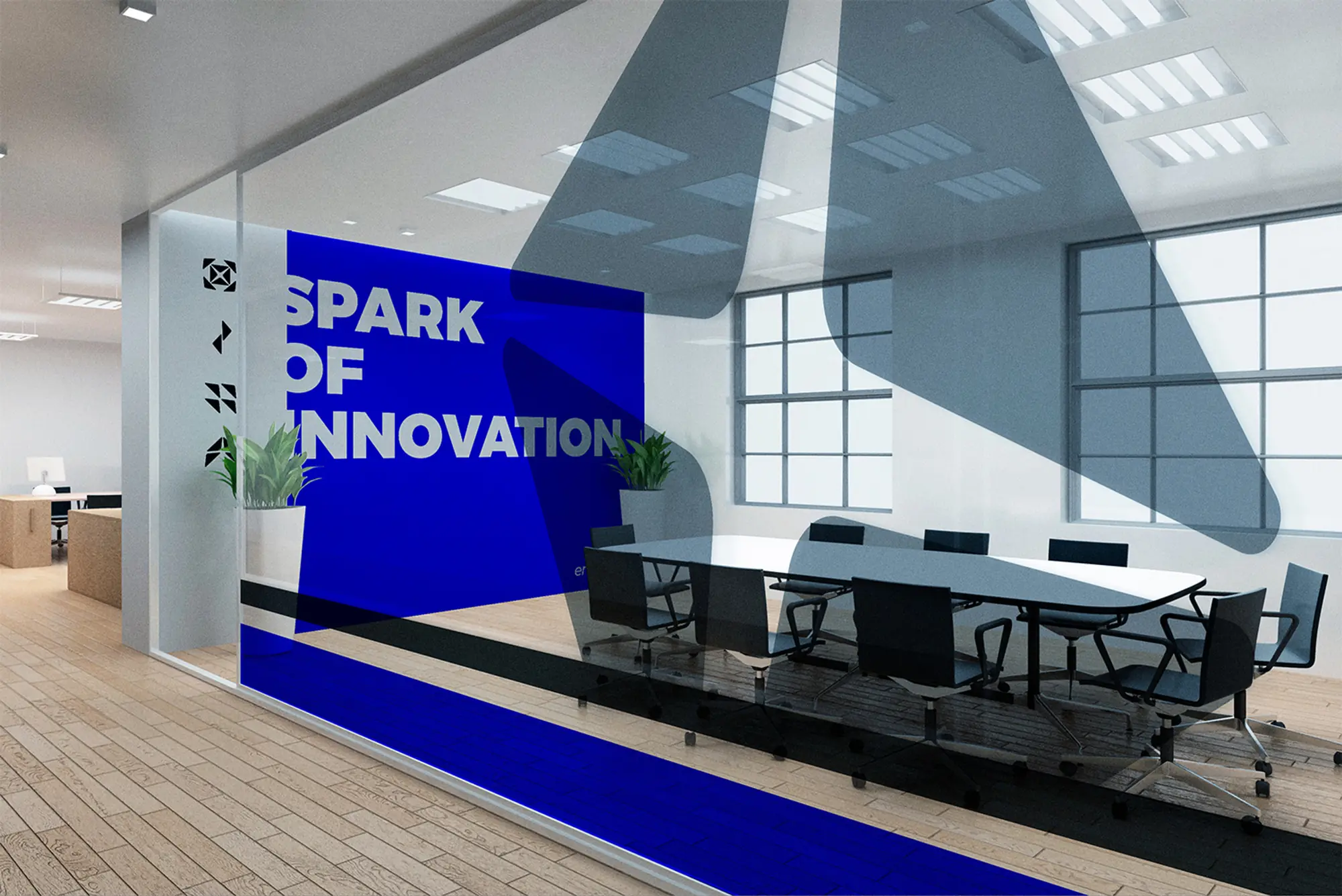
Emilcam — Spark of innovation
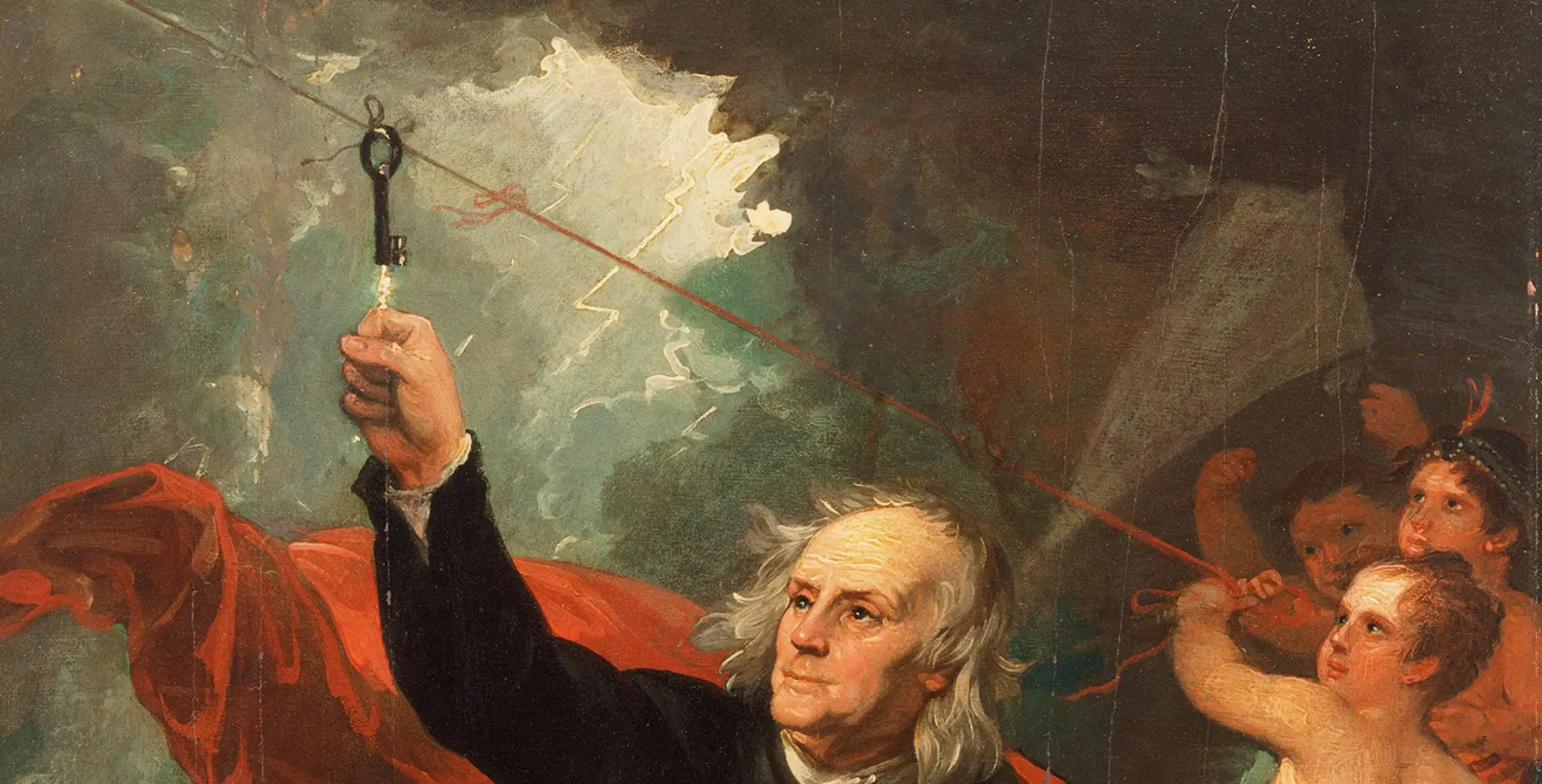
An identity for a building-systems and construction company in Rome: a kite split into four modules, with a spark at its center. A nod to Benjamin Franklin’s kite experiment.
01 Brief
A nimble company, many trades under one mark.
Emil Cam srl is based in Rome, in the Quarto Miglio neighborhood of the city’s seventh borough (Municipio VII). It’s a nimble, professional company that pools the experience of people with different backgrounds and covers every area of building systems and installation work, electrical and electromechanical construction, and IT.
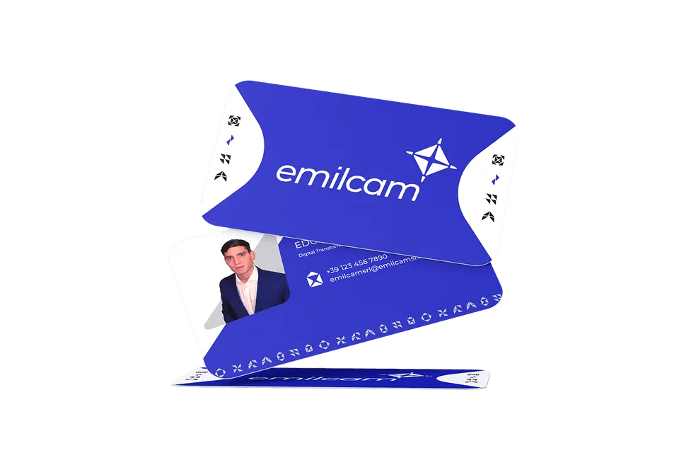
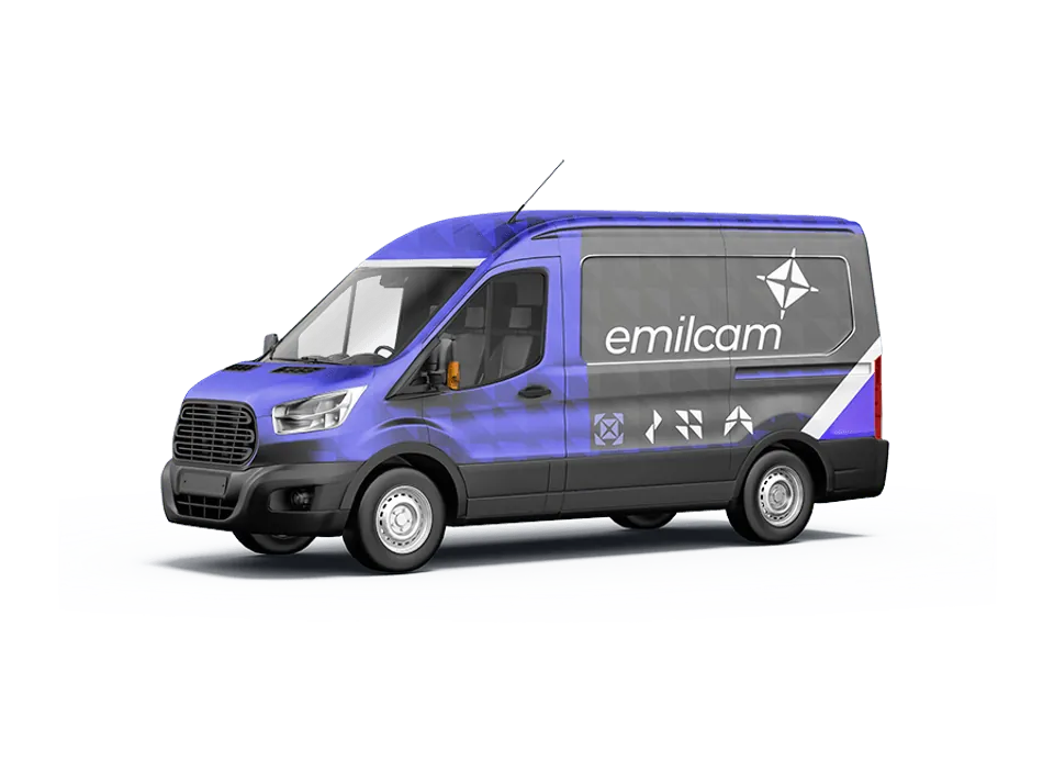
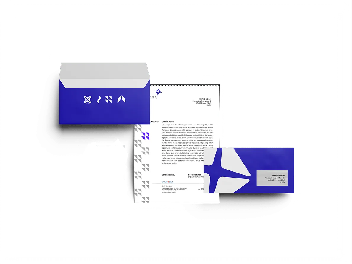
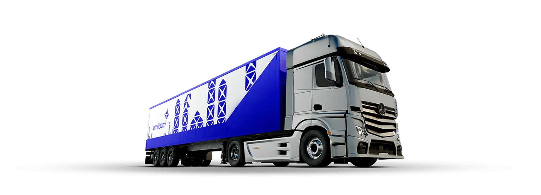
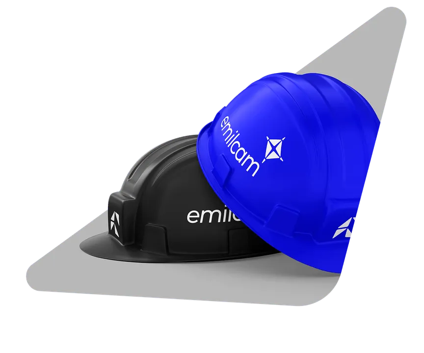
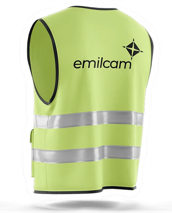
The project gives this range of expertise a single identity, one that works just as well on a business card as on a van or a construction site.
Service areas and systems
- Mechanical
- Electrical
- Plumbing
- Construction
02 Origin
Catching a spark.
To tell the story of the new identity, we chose a metaphor that combines ingenuity, energy and vision: Benjamin Franklin’s kite experiment.
That seemingly simple gesture holds one of the most powerful insights of the modern age: the ability to catch a spark and turn it into knowledge, into potential, into the future.

Energy
The spark: the energy of innovation.

Vision
Flight: the ambition to look ahead.

Ingenuity
Modular geometry: technical know-how, organized.
03 The logo
From kite to mark.
- 01
A kite
The mark grows out of that first image: the kite and the spark as symbols of ingenuity and transformation.
- 02
Four modules
The kite is split into four distinct modules, one for each of the company’s areas of work. The modular geometry speaks of organized technical know-how: structured, interconnected and ready to evolve.
- 03
The spark
At the center, a spark switches on the connections: it’s the dynamic core that gives the form cohesion and tension. The reference to the electrical experiment is conceptual: conductivity evokes the technological heart of the business.
- 04
Tilted forward
The logo tilts like a kite in flight, conveying dynamism and a forward-looking outlook.
- 05
A trajectory
The symbol sits above and to the right of the logotype. That forward shift suggests a trajectory that isn’t static but active and on the move: spark of innovation.
04 System
Simple rules, endless uses.
Versions
Primary Silver and Lapis on white
Reversed White on Lapis
Monochrome Marble on Graphite
Monochrome Graphite on Marble
Icons
The logo’s basic module adapts to many uses across communications: combining the kite’s triangles produces the system’s icons, for signage, vehicles and documents.
- Directionspeed, flow
- Waitpause
- Mailnotification
- Sustainabilityventilation
- Work sitework in progress
- Goodspackages, block
05 Colors
Four materials, four meanings.
-
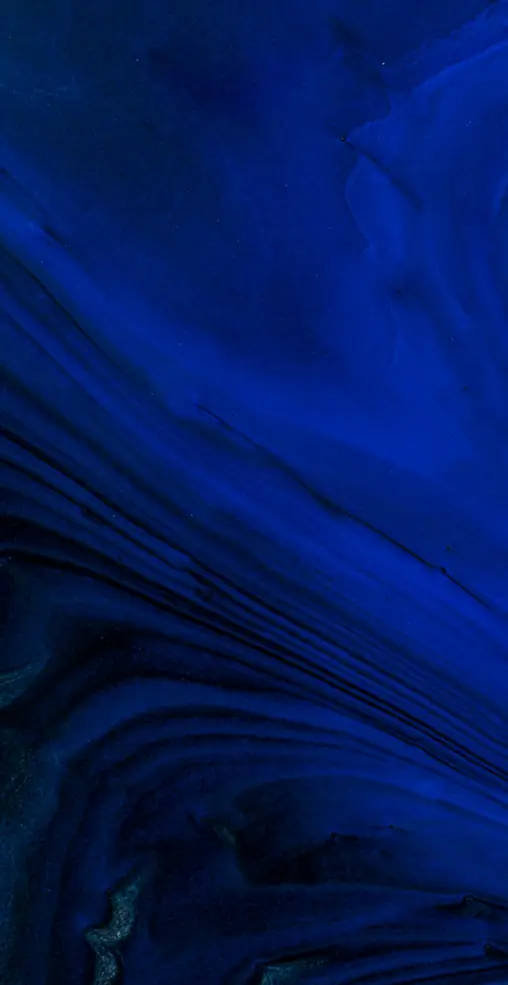
Lapis
Pantone 2736 C
#211FB4Lapis Blue colors the kite-and-spark symbol. Long associated with knowledge, vision and intuition, it stands for the design side of the brand: an idea taking shape and rising.
-
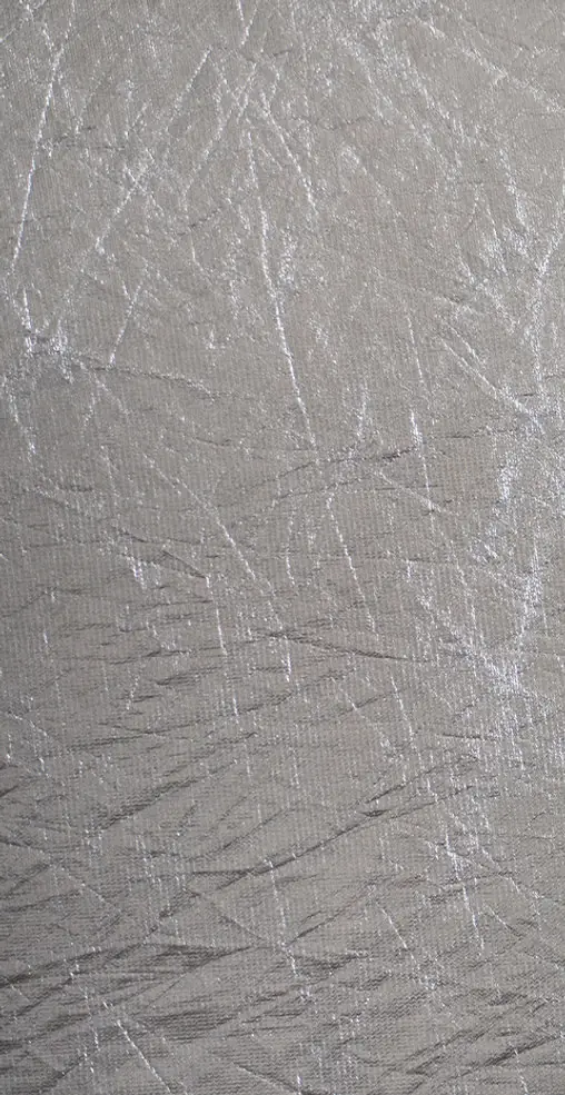
Silver
Pantone Silver 10077 C
#939394Silver is the most electrically conductive element in nature: a direct symbol of technological efficiency, speed and quality.
-
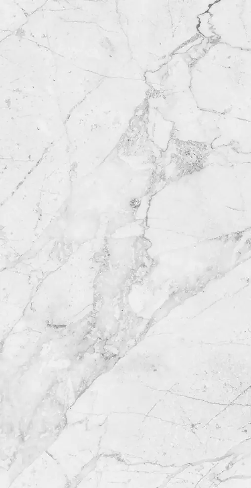
Marble
Pantone 000 C
#F3F3F3Marble White is used for the monochrome version on dark backgrounds. Marble, the noble stone of buildings and monuments, evokes solidity, order and permanence, and gives the system an institutional, architectural tone.
-
Graphite
Pantone Black C
#121212Graphite Black is used for the monochrome version on light backgrounds. Graphite, the medium of technical drawing, calls to mind study and design: precision and control.
06 Applications
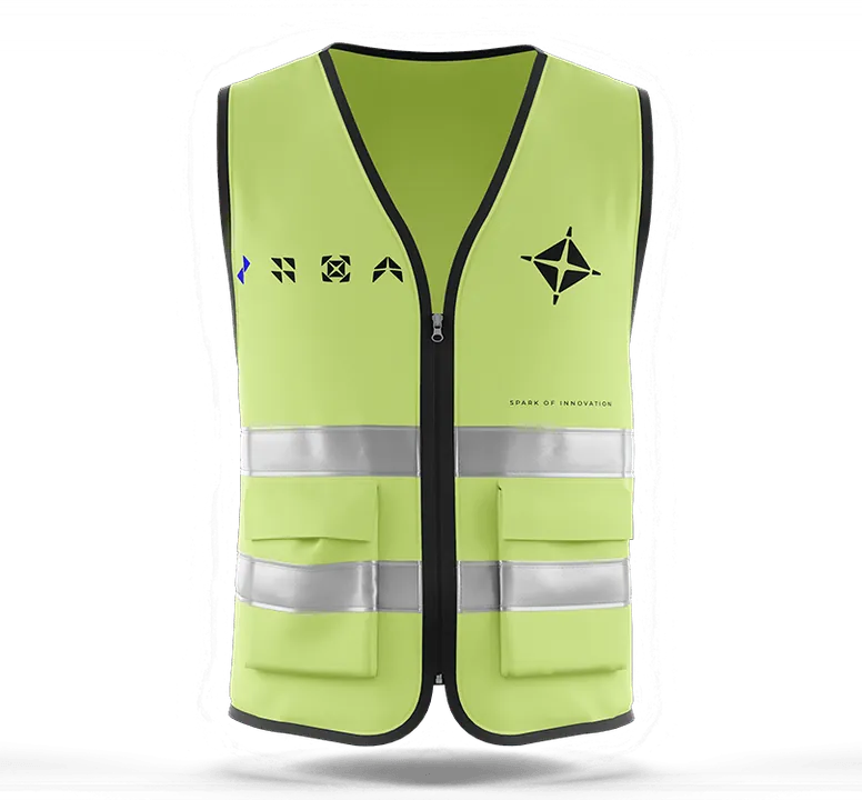
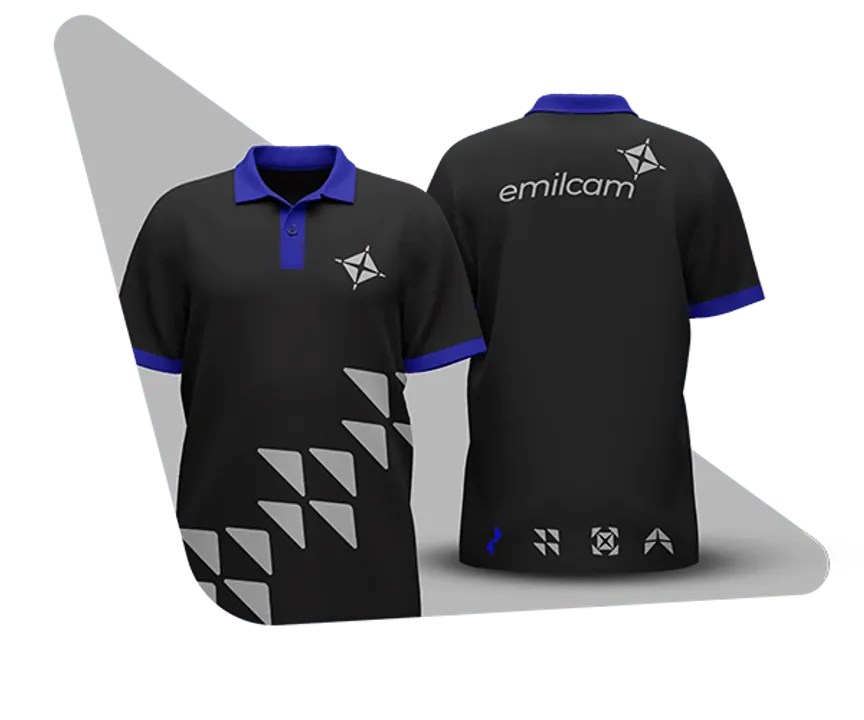
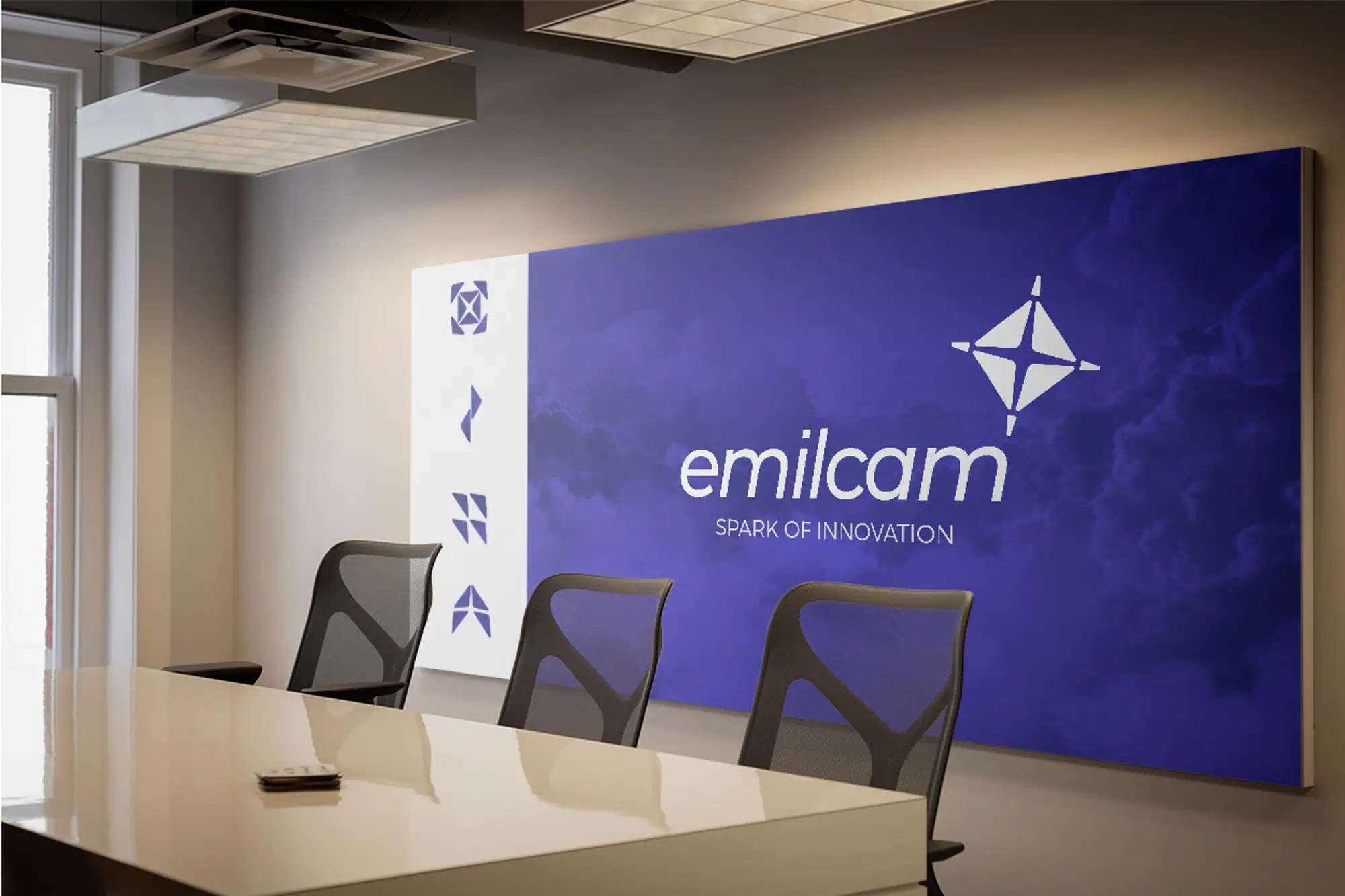
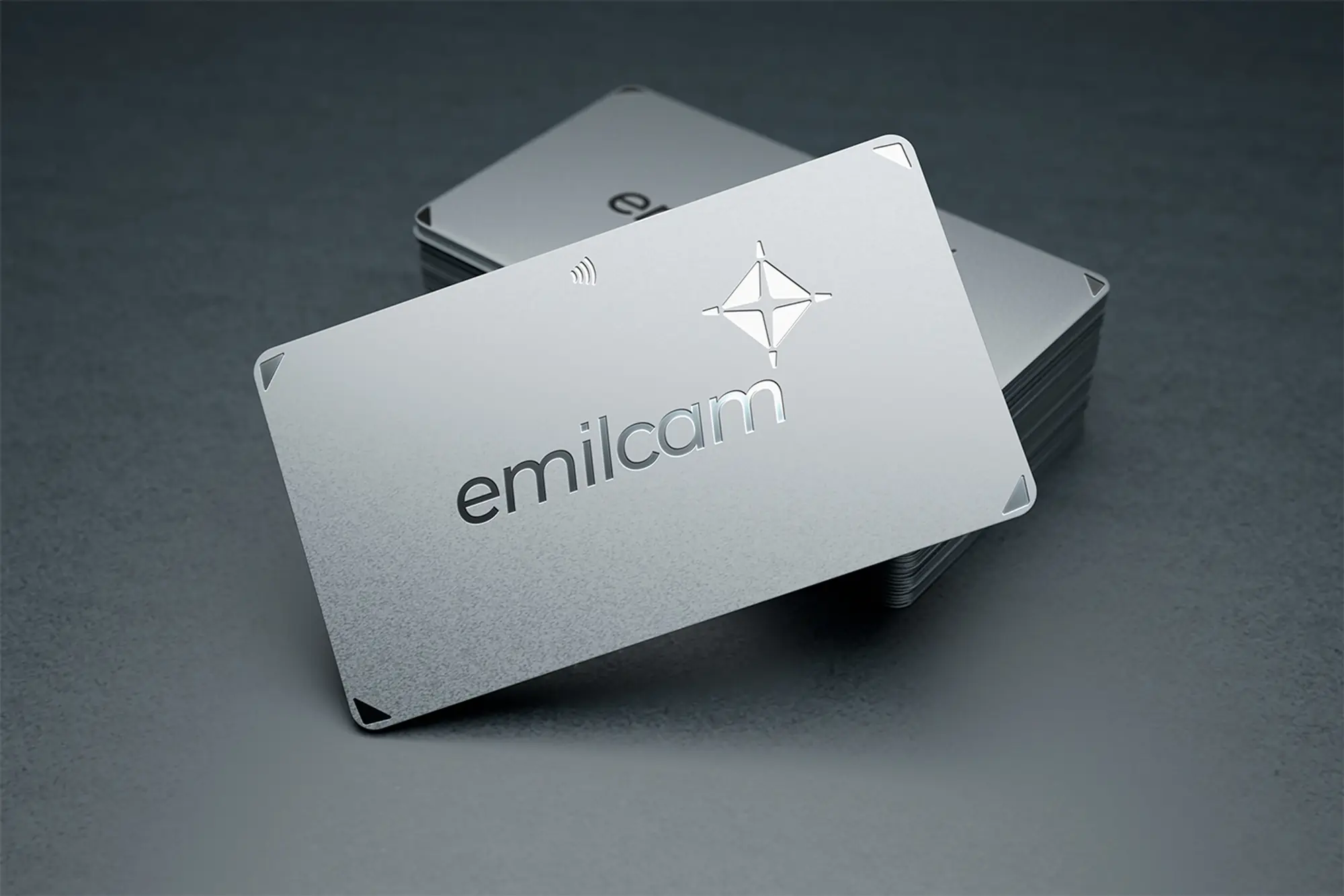
From business card to construction site.
Interactive scene built with Spline. Requires an internet connection.